O boy and it’s the final weekend of May and I simply cannot believe it!
Happy to be sharing another insightful perspective from our president today.
And for this week Donna J. Jodhan talks about some quirks of technology.
Send along your thoughts on this topic to Donna at donnajodhan@sterlingcreations.ca.
I’m Scott Savoy wishing you a great end of May weekend.
+++++++++++++++
Some quirks of technology
By Donna J. Jodhan
Some Quirks of Technology explores my personal experiences and observations
navigating the ever-evolving digital landscape, particularly as it relates to accessibility.
One of the ongoing challenges is how screen readers struggle to keep pace with modern technology. Different screen readers often interpret the same website differently, and their performance can vary even more depending on the browser being used—whether it’s Chrome, Edge, or Firefox. For example, a page that reads clearly with NVDA in Chrome might behave differently with JAWS in the same browser.
These inconsistencies extend to email clients as well, creating a fragmented experience that depends heavily on specific combinations of software versions. It’s a constant juggling act, highlighting the need for greater consistency and collaboration in tech accessibility.
I’d like to leave you with this for consideration.
Scene: A Digital Crossroads – The Journey of Accessibility
Imagine a wide, open digital landscape stretching endlessly in all directions — a symbolic internet world full of information, services, and opportunities. At the heart of this landscape stands a crossroads. At the center is a group of blind and vision-impaired users, each holding a digital compass — their screen reader.
Each screen reader speaks to them in a unique voice: some calm and clear, others rapid and robotic. These voices are lifelines, translating the visual internet into sound and touch. But the roads ahead are not all equal.
Each path represents a different browser — Chrome, Firefox, Edge, Safari — and the terrain on each one varies wildly depending on the screen reader in use.
One user pairs NVDA with Firefox — the road becomes a paved path with relatively smooth signposts. The user’s digital compass reacts well, describing links, headings, and buttons with reliable clarity. But even here, potholes exist: dynamic content loads without warning, or forms become confusing mazes of unlabelled fields.
Another user tries JAWS with Chrome — the road is mostly smooth but cluttered with pop-up obstacles that speak over each other. The user has to pause, backtrack, and listen closely, sometimes guessing whether a button will actually work when pressed.
Someone else, using VoiceOver on Safari, steps cautiously along a narrower path — polished for Apple’s ecosystem, but with tricky intersections where ARIA labels are misused or web elements aren’t coded with accessibility in mind.
As these users navigate, their fingers rest on Braille displays or flow over the keys with memorized shortcuts. They’re constantly calibrating: “Is this page using headings properly?” “Does this button tell me what it does?” “Why does the screen reader go silent here?”
Some roads unexpectedly vanish — a browser update breaks compatibility, a website redesign forgets its accessibility.
Around them are developers and designers — some handing out helpful maps (accessible websites), others unknowingly building roadblocks (auto-playing videos with no stop button, unlabeled CAPTCHA images). A few tech-savvy guides emerge — online forums, tutorials, and peer groups sharing wisdom: “Try NVDA with Firefox on this site,” or “Use Chrome with JAWS for that banking portal.”
It’s not just about preference — it’s survival in the digital world. The right combination of screen reader and browser can mean the difference between independent access to education, work, health services — or being shut out by invisible barriers.
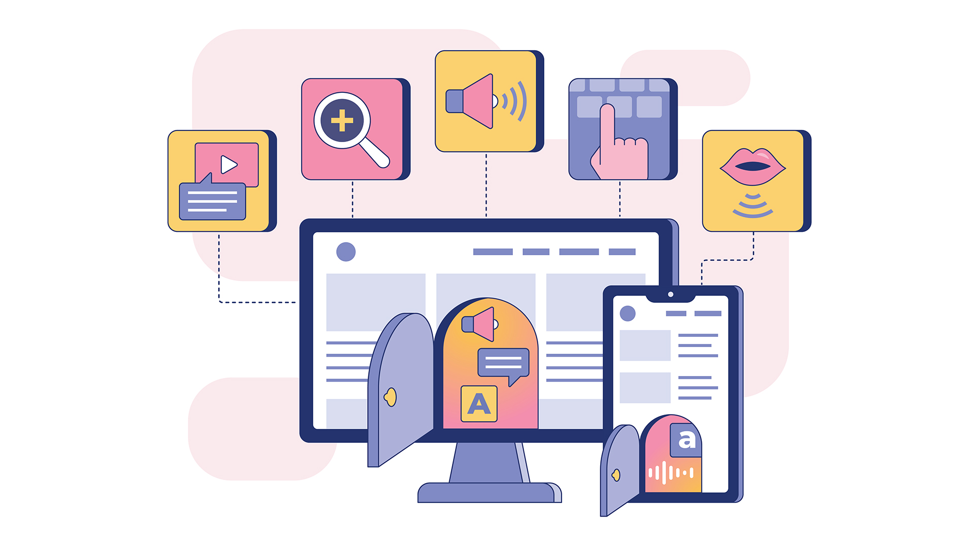
Image = An illustration of digital accessibility features showing a computer monitor and a smartphone with small open doors revealing icons for text, speech, and audio options. Surrounding the devices are colorful square icons representing various accessibility tools, including video captions, zoom/magnification, sound, keyboard input, and voice commands. Dashed lines connect the icons to the devices, emphasizing integration of assistive technologies. The overall color scheme is soft with shades of pink, yellow, blue, and purple.
To learn more about me as an award winning sight loss coach and advocate visit http://www.donnajodhan.com